Accessibility · 16 min read
Being an a11y: accessibility for web apps 🤝
What web accessibility (a11y) is, why it matters, and practical steps — semantics, ARIA, labels, focus, and contrast — with minimal overhead.

Tejas Upmanyu
Staff Software Engineer
We as developers often fail to acknowledge that web is a diverse place, meant for everyone, not just for the physically abled. There is a significant number of people who use the web but don’t possess the same set of physical faculties as other more abled users, physical disabilities should not stop anyone from accessing the web and your apps, should it?
The intention behind this blog post is to discuss Accessibility (a11y) for Web applications as well as to layout some ways using which you can make your apps more accessible than they are already with minimal development efforts. If you know about Accessibility, the ideas and concepts shared here would be of marginal interest to you but if you are new to the term, I’d like to clear some mist around the topic, I care about.
What is Accessibility and Why should you care? 👨🏻🦯
So, accessibility or often abbreviated as a11y (a and the 11 letters in accessibility till y) refers to the degree/features/considerations on your web apps that make the app more accessible and usable for your users with physical disabilities like motor disabilities and sight related issues. Accessibility is all about enabling and empowering people with with physical limitations to access your applications on the web. Technology is a great enabler, especially for the disabled. I think it is well within our duty as frontend engineers to make our apps ‘accessible’ and open to all.
What’s more concerning is not that apps are not accessible but the fact that most developers often have a hazy understanding of the term. The section who do understand accessibility often don’t take it as seriously because disabled users are ‘minority’ users. It is time we let the myth of the minority user go, because facts state otherwise. According to a 2017 WHO report, over a billion people on this earth live with some form of disability. That’s over 15% of the global population, not really a minority group. Especially when we put this in juxtaposition with the fact that the web is now preparing for the next billion users.
Ensuring accessibility is not just for the disabled, it is broadly observed that measures taken to ensure accessibility often enrich the experience, hence making it better for other users as well, so everyone wins. Data and figures on the disabled using the web are very hard to find, especially in the context of the subcontinent which adds on to the mist of ignorance when it comes to accessibility.
Accessibility is not just about the ‘disabled’ per say. As we age, our senses tend to get weaker especially sight. It is quite bizarre to think that people who we casually call boomers today (born around 1950-70) who would be about at least 50 years old now, the very people who saw the invention of web, the people who invented the web and laid ground for most of the tech we see today won’t be able to comfortably use our apps. Or just think about a slightly old developer, YOU in 2050, finding it hard to read those small letters on the screen and navigating an app on that fancy app. Are we just going to ignore the difficulties faced by those elderly or temporarily disabled users as well? Are we just going to de-prioritise a better experience for a 60 year old YOU? See suddenly, accessibility makes sense right.
Assistive Technologies 💻
The web as a platform already has some super useful stuff baked in to enable accessible experiences for everyone. Some most used assistance platform provides are:
Keyboard Navigation
Enabling users with situational, temporary or permanent motor disabilities to use and navigate your applications using keyboard.
Screen Readers
Screen readers are utility software which help people with sight related issues in navigating and consuming the content on the web. The most popular examples are - Voice over on Mac and NVDA on Windows
Principles & Guidelines 📜
Standard guidelines and principles for ensuring accessibility on the web have been put together by platform and accessibility experts into a document known as WCAG (Web Content Accessibility Guidelines). WCAG contain a ton of recommendations, patterns, guidelines and principles, which if followed make applications accessible to a wide range of disabled folks. WCAG is based on four (read POUR) cornerstone principles -
- Perceivable - The content/application should be perceivable by the user. Don’t confuse perceivability with sight. People with different disabilities might perceive things differently.
- Operable - The content/application should be operable by the user, often inter-switched with usability. Users with disability should be able to use, operate, navigate your applications.
- Understandable - The content/application should be understandable by all. Experiences on the web should be clutter and confusion free.
- Robust - The content/application should not break on different browsers or when being consumed using different assistive technologies like the ones mentioned in the previous section.
Well at this point you might be overwhelmed or all of this might appear hazy and vague to be implemented right? Well WCAG is a long document and discusses these points and associated patterns and guidelines in details. WebAIM (Web Accessibility In Mind) and The a11y Project also have a clear, concise list and processes that can be followed to achieve maximum accessibility on the web.
Small Steps Towards Accessibility 🧗🏻♂️
So enough theory and principles, what can you do and start doing today in your code to ensure you are on your way towards accessible applications? Here are some small steps and conscious decisions you can take which will incur minimal development efforts but can yield high accessibility.
Semantics Matter. ✔️
Use of proper HTML Semantics play a very big role in making your apps accessible. If you haven’t heard about semantic HTML, here’s a quick definition -
Semantic HTML or semantic markup is HTML that introduces meaning to the web page rather than just presentation. For example, a
<p>tag indicates that the enclosed text is a paragraph, an<a>tag indicates a link etc. This is both semantic and presentational because people know what paragraphs are, and browsers know how to display them.
Use of semantic HTML elements can go a long way in helping you gain on accessibility. Since browsers attribute a meaning to these semantic HTML elements, Keyboard accessibility is fulfilled out of the box in most cases. We often undercount the power of semantics as we never come across the cool baked in features they often. Use of semantics is not only about keyboard accessiblity but about writing more meaningful markup, which enables browsers to offer optimised experiences with these elements on web and mobile.
Examples of semantic HTML tags include:
- Header tags
<h1>through<h6> <blockquote><nav><aside><main>and a lot more.
Here are some key points and mistakes you should avoid -
-
<div>is not the only tag in HTML for grouping. There are more meaningful and semantic tags, think before using divs recklessly. -
Use headings & landmarks, they enable better and efficient navigation with screen readers.
- use heading tags
- don’t skip heading level tags, skipping between heading tags, i.e using a
h3before ah2breaks page structure and might confuse screen readers.
<!DOCTYPE html> <html lang="en"> <head> <meta charset="UTF-8" /> <title>Sample App</title> </head> <body> <h1>Main Heading</h1> <h3>Sub Heading</h3> <div class="card"> <h5>Card Title</h5> </div> </body> </html>- You can add hidden headings if not in design to make screen reading experience better.
- Use landmark elements -
<nav>,<aside>,<main>etc, people avoid them but they offer better and more efficient navigation using semantics built in.
Use the platform! 🕺🏻
- Try to use the elements provided by HTML as much as possible. They have focus, keyboard support, semantics built in!
- Just use the button, instead of using divs and adding click listeners to them. A common accessibility anti-pattern is to treat a non-interactive element, like a
divor aspan, as a button by adding a click handler to it. Which handles the click event but does not offer - focus via the keyboard, support being disabled, support theENTERorSPACEkeys to perform an action, announced properly by a screen reader. All of which is very much required for accessibility - Understand links vs Buttons. Links are meant for navigation while buttons are meant for actions. Adding onClick on an
<a>is considered an accessibility pitfall because links and buttons are read differently by screen readers. - But as we all know HTML element primitives are hard to style and that is something that is slowly but definitely changing but It is still early days. It is common to stumble upon a design which requires you to create custom components or use different HTML tags to imitate a functionality by another HTML element. That’s where ARIA jumps in.
ARIA and Accessible Design Patterns 🔖
Sometimes (happening most of the times now) is that simple HTML elements aren’t enough for fulfilling design requirements. I said use the platform but platform elements today are ugly out of the box and in general are really hard to style according to needs. That’s where WAI-ARIA enters. WAI-ARIA stands for Web Accessibility Initiative - Accessibility Rich Internet Applications. Yes, if you can remember the full form, you get good karma points. Often just referred to as ARIA. ARIA is a specification which allows you to specify extra attributes on your elements which instruct the browser to interpret the elements differently in the accessibility tree.
One of the most occurring problems where ARIA fits in is - custom radio buttons and checkboxes, If you have been asked to write a custom checkbox, you know it is just not possible with the primitive checkbox provided by the platform. We then retort to using some divs and spans and some pseudo classes to make that div appear and function like a checkbox, but that is just half the problem solved because for screen readers that is still just a div and a screen reader is just going to read it as a group. It is not going to tell the user that it is a checkbox and it’s current checked state.
Using ARIA we can tell the browser to interpret these elements differently in the accessibility tree and hence the screen readers will ‘read’ them differently. Just add role="checkbox" and aria-checked="true" to indicate that the role of this div is a checkbox, so it basically is imitating a checkbox and the checked state is true. That’s all, screen readers will now read those custom checkboxes as checkboxes with their state not just speak them out as groups. How cool is that?ARIA attributes help us modify the accessibility tree but have no effect on the appearance or behaviour of that element. It doesn’t really add or change anything except adding additional semantics to a element. You’d still have to add keyboard support for these custom checkboxes.
ARIA gives a lot of tools and goodies to make existing and custom UI patterns possible and accessible rich. But beware, since ARIA puts a lets developers modify the accessibility tree, bad values to aria attributes can do more damage than good. As the ARIA guide says, “No ARIA is better than bad ARIA” , consider this example.
<div role="button">Sign up</div>Giving this div a role of button will make screen readers and other assistive technologies consider this div a button, but there’s no button functionality implemented (onClick and more), this is example of bad ARIA as user expects this to be button, but it isn’t and will leave the users perplexed. The knowledge of ARIA authoring practices and design patterns to be kept in mind while writing custom components is really important, this official guide and the folks at a11yProject have done an amazing job putting these principles together, do check them out.
Art of Labelling ✍🏻
Remember we discussed the core principles of WCAG some time ago? The first principle of POUR (Perceivable, Operable, Understandable and Robust) - The UI/Content should be perceivable by users, i.e they should be presented in ways that all users can perceive them. The very first Guideline states that we should provide text alternatives for all non-text content like images, icons etc so that it can be transformed into forms people with disability can understand like speech, braille, symbols or simpler language etc. It also states that controls, which also are non-text content and accept user input must have a name describing their purpose
So how to we label elements? Well, browsers get smart in some cases and use the textual content of the element as its label, for example a button with text ‘sign in’ automatically gets the name ‘sign in’. In case of other input elements like checkbox which doesn’t have associated text with them, you can use the text and the checkbox wrapped in a <label>. But in some cases we have no visible text associated with a control, for example buttons with icons as their content. How do we add non visible labels to them? ARIA can again help us here. By using aria-label attribute, you can provide a non-visible label to a element which will be used by screen readers and trumps other kind of labelling methods, like textual content.
Adding succinct and meaningful labels to elements and especially control elements is an art and adds greatly to the experience of users who are visually impaired as screen readers pick out the associated labels and read them out, giving users a better sense of layout, controls and associated behaviour.
Distinguishable Hover, Focus states. ✨
We should try to have distinguishable hover and focus states for control elements, hover states give a visual indication that the element over which the mouse is being hovered is actually something which can be interacted with, hover states help users differentiate interactive elements on a page from non-interactive elements, and while these visual cues might not seem to do a lot, they really contribute to a better user experience while using your app.
Focusing on ‘focus’ 👀, focus indicates which element on page is ready to accept user keyboard events. Consider ‘focus’ to be the mouse ‘pointer’ for folks using keyboard for navigation. The blue bad outline you see on your custom buttons or a HTML input field when clicked is called focus ring. And developers don’t really like it, because it is often an ugly blot on your stellar app. So what we do is just add some css to make outline 0 and then sleep peacefully knowing they’ve removed an irritating, ugly thing from their app but what we often don’t realise is that we’ve essentially hidden the ‘pointer’ for users using keyboard, essentially making the app unusable for them using keyboard because now they can’t figure out which element is in focus.
So how to avoid the ugly outline on click but still maintain it for users using the web app using a keyboard? There is a CSS4 working draft on :focus-visible pseudo class, which will let developers apply styles to indicate focus on elements when they are used. Though since this is still a working draft it is not implemented by any browser but Firefox.
Colors & Contrast 🌈
Modern web apps carry a whole lot of style and colors. The choice of colors is really important, even more the contrast. Contrast can be crudely called the difference between two colors. Imagine a color wheel, two colors really close to each other like blue and indigo would be really hard to discern if one is used as background and other as foreground color. Colors placed far apart on the color wheel have really great contrast but doesn’t mean they’ll look really great together (subjective choices!). In context of web, colors are an integral part of text, images and other kinds of content, if the contrast is not good enough, users will find it really hard to percieve the content, leading to bad user experience.
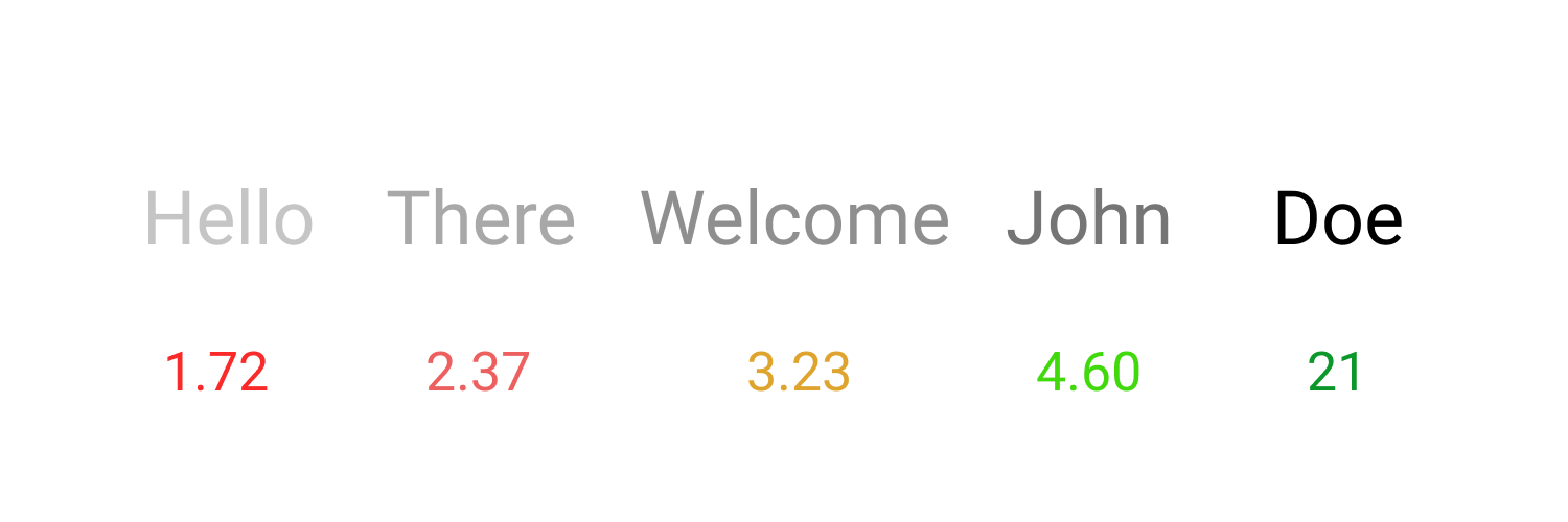
Increasing Contrast levels
WCAG 2.0, section 1.4.3 suggests some minimum contrast levels to be maintained for good readability.
- Text and Images should have a contrast ratio of 4.5:1, which means the the difference of luminescence between foreground and background colors should be atleast 4.5 to 1.
- Whereas, large text (over 18pt or 14 bold) should have a contrast ratio of 3:1.
There is an enhanced version (1.4.6) of the guidelines, which I prefer mostly because of Its’ considerations towards elderly people and people with vision impairments, which suggests -
- Text and Images should have a contrast ratio of 7:1.
- Whereas, large text (over 18pt or 14 bold) should have a contrast ratio of 4.5:1.
There are some great tools out there for contrast ratio calculation, here’s one I use mostly.
Inert Elements 💈
Have you seen or written that sidebar with some links which a user can hide? or some other UI component for that matter which can be toggled to be not visible on the screen? In most implementations of that hiding sidebar we use some transitions to slide out the sidebar into far left/right of the viewport so it is no more visible to the user but it is still there in the DOM and so it is picked up by keyboard or screen readers even and while your users are tabbing through they see no element focused on the screen because actually the focus is on some element on that hidden sidebar, this is a really confusing experience. Elements that are hidden should also not catch focus right?
To make the browser “ignore” the element from assistive technologies, page search and text selection, you should use the boolean inert attribute. As of today, it is not included in any browser but there’s an active web standard proposal. Until then, you can use the polyfill.
Accessible 3rd party components 🔗
A lot of the development today depends on 3rd party components and packages from NPM. Consciously choosing and using components/libraries which are accessible or have accessibility as one of their foremost concerns can help your application score more on accessibility.
Auditing & Culture 💡
Auditing and frequent reviews are a great way to ensure that the apps you build are accessible. There are some great tools out there to help you score big on accessibility. Here are some most used ones -
-
Axe by Dequeue labs is an open source accessibility testing engine for web UIs. It can easily integrate with any existing testing environment and can help you catch those accessibility issues during development. There is a super useful chrome extension for it as well.
-
Folks at Chrome have built some really nice features and tools around accessibility in Chrome developer tools. Lighthouse also includes accessibility testing built on top of axe-core and since Lighthouse is now part of chrome developer tools, It is easier than ever to audit accessibility of your app while developing.
-
A11Y by Addy Osmani is a great command line utility for generating accessibility reports.
-
There are plenty of linter plugins available for pointing out accessibility issues with your code. If you are React dev, make sure to use
eslint-plugin-jsx-a11y -
How to do a quick accessibility audit?
Anyone whether a developer or not can do a quick accessibility audit to check if there are some major accessibility loopholes, which can be fixed. This method is not exhaustive, but does cover the most important aspects of accessibility.
- Start navigating use tab key on the web page, you should be able to navigate properly and with differentiating focus styles, make sure you can reach every interactive element using tab key.
- Check if focus is not going to elements which are hidden or off screen.
- Simplistic page navigation using screen reader.
- Page must be using appropriate headings and semantic HTML, landmark roles.
- Check for colors and contrast, some sections with low contrast levels might be difficult for users to read, you can use the Axe chrome extension for it.
-
As with all non-functional requirements, you need to build a culture which cares about those requirements, so is the case with accessibility. Until senior engineers, managers and leads put a price and cultivate a culture which is founded on talking and caring about these requirements, such efforts are hard to sustain.
-
As developers, we ought to advocate accessibility with clients and stakeholders who might not know about it and its’ significance.
Inspirations on the web 😇
What do accessible web apps feel like? Or what are some great examples for inspiration? I personally, really admire the work done by the following web apps on accessibility front. Check them out, use them with keyboard or a screen reader, they are so good!
Delivering Considerate Experiences ❤️
Internet started out as a means of communication, email and stuff. The fact that one person changes something at one place and it reflects on the other’s computer is a quite overlooked power of the web. The web has come a long long way, It is not just about communications or email anymore. We have been packing and delivering entire user experiences on the web for quite some years now, and not only experiences some really great experiences are today delivered on demand using just a random string we call url.
We being in the thick of this great revolution called web, often don’t realise Its potential and the impact of the experiences we ship. Several multi-billion dollar companies have been built on top of ‘just’ web apps and at the centre lies great, considerate user experiences. Yeah functionalities are all cool, but they are just the first step. Strong focus on non functional requirements whether it be performance or user experience or accessibility or what not are the real differentiators between the experience you ship and what’s already there on the web.
So every time you crack your finger joints before writing a user interface, think about the user who’s going to see and use this app and will just be awed by the considerations you’ve put to make their experience so nice and inclusive, and that delight is what keeps the music going.
- Accessibility
- a11y
- WCAG
- HTML
- ARIA